


Life expectancy in Germany 2024 - all-time highs in the late year
The gap has closed.

This week, Destatis delivered death figures up to 2024/cw52. This allows an initial assessment of life expectancy for the entire last year. One result is that the 52-week moving averages have climbed up to new all-time highs in the calendar weeks 50, 51 and 52, which can possibly be seen as a return to normality.
A few words about the method. The time series used here is calculated from the weekly death figures and a weekly interpolation of the population development in 14 given age cohorts. As an intermediate result, weekly mortality risks are obtained, which can be converted into weekly life expectancy figures after disaggregation of the age cohorts. The method proved to be quite accurate in backtests. Compared to the official annual figures, the average absolute value difference was 15.7 days. However, it is not certain whether the annual method is more reliable.
An Overview of the course since 2000 is given in Fig. 1. Two trend lines are added, a 52-week moving average and a long-term trend. The latter is obtained from the fit function y ~ A - B * exp( -C*x ) over a training period from 2000/cw1 to 2020/cw52. The constant A results in 81.63 years of life. Its meaning is that no increase above this value is possible if the trend regime continues.

Fig. 1: Time series of German life expectancy 2000-2024. Weekly course (green), 52-week moving average (black), longterm trend (blue).
With a steadily increasing trend, new record values were constantly occurring with some interruptions in the past (Fig. 2).

Fig. 2: German life expectancy, 52-week moving average (black), all-time highs (red triangles).
What is particularly striking is an unusual gap lasting over 4 years. A zoomed-in view shows that the sequence of all-time highs broke off in 2020 and reoccured late 2024. The last week also slightly exceeded the long-term trend line (Fig. 3).
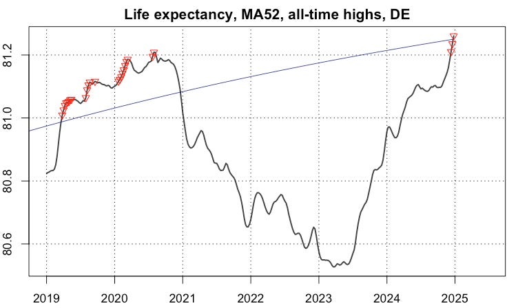
Fig. 3: German life expectancy, 52-week moving average (black), all-time highs (red triangles), long-term trend (blue).
The reason for this recent development, which has come as a surprise to some, is the relatively low death rates in late 2024. In previous winters, there had been a shift in the seasonal maxima. These usually occur around the 10th calendar week, but from winter 2020/21 onwards they occurred near the turn of the years. The return to normality of seasonality can possibly be seen as a positive sign. However, it remains to be seen what the expected wave of deaths in the coming late winter and spring will be.
A user on X, “spatzenkonzert”, asked me for figures about loss of lifetime (LLT), which I attach here for the sake of completeness. I computed them as yearly means of the differences of the green and blue curves in Fig. 1.
   year          LLT
1  2000  0.109122884
2  2001  0.117499344
3  2002 -0.083201777
4  2003 -0.298601121
5  2004  0.039517587
6  2005  0.009152108
7  2006  0.144266880
8  2007  0.115756704
9  2008  0.038970705
10 2009 -0.069541108
11 2010 -0.027566107
12 2011  0.040817361
13 2012  0.045504953
14 2013 -0.135000012
15 2014  0.195361808
16 2015 -0.184684858
17 2016 -0.014667708
18 2017  0.009758247
19 2018 -0.124014621
20 2019  0.096568252
21 2020 -0.025019520
22 2021 -0.438330244
23 2022 -0.566573031
24 2023 -0.248214139
25 2024  0.039401827
Table: Loss of lifetime in the unit “year” (LLT) by calendar year.
Caution is advised when interpreting these figures. They only contain information about a limited period of time and are derived from the subset of those who died during this time. However, we can argue that around 1 million people die in Germany every year. For example, the LLT in 2022 of -0.567 years means a gross loss of 567,000 years of lifetime. This is the maximum value of annual LLT in the entire time series. But 2021 (rank 2, LLT = -0.438) was hardly better.
Anyone looking for a reason for the exceptionally poor performance in these two years should ask themselves what was different during this time. Officials and many media outlets were quick to downplay the excess mortality by pointing to the C19 pandemic. However, this argument falls apart when we take a closer look at the course of life expectancy in 2020. Regard the enlarged section in Fig. 4.

Fig. 4: German life expectancy in 2020, 52-week moving average (black), long-term trend (blue).
The diagram reveals that the 52-week moving-average was constantly above the long-term trend line in nearly the whole year 2020, while the virus was certainly circulating the whole time. So we cannot claim that the virus led to the excess mortality observed later. We should all keep this result in mind and judge by it anyone who argues with alleged virus deaths to justify any measure, no matter what it was.
Sehr einleuchtende und aussagekräftige Grafiken! – Die auffällige Verschiebung der höchsten Sterblichkeit vom 1. Quartal des neuen auf das 4. Quartal des alten Jahres, und zwar drei Jahre lang ab 2020/2021, war auch mir schon aufgefallen bei einer Grafik von Prof. Stefan Kraus, die ich unter https://www.youtube.com/@winnieschneiderpolitik/community aufgriff und auf einer zweiten Seite unter https://drive.google.com/file/d/10d20Ou0tIKDZNz4n3N1aM6la4VANDjGp/view entsprechend kommentierte. Die Verschiebung betraf übrigens zugleich auch die beiden Sommerquartale!
Your data is clear and easily understood. Thank you 🇨🇦