


Lunatic results from British death and vaccination figures
A funny expample of Simpson's paradox

ONS, the British statistical authority, provides data about all cause death rates and vaccination status, which can lead to erroneous suggestions.
Some days ago, a colleague drew my attentention to an evaluation of these figures. The result was, C19 vaccination led to increased all cause mortality in the vaccinated population 18+. A bit very suspiciously too clear.
Although I consider this thesis to be probable, the presentation seemed stange to me, also because the data came from UK. I had some bad experiences with the ONS data at the start of the vaccination campaign. I wondered what would normally be expected under realistic demographic assumptions and made a thought experiment. I based this on the demographic conditions in Germany because I am familiar with them. They probably differ only slightly from the UK.
The main outcome is the risk ratio (RR) of a vaccinated person compared to an unvaccinated person, under the somewhat silly condition that pure water was in the jabs. In each age cohort, then deaths and subpopulations only depend on the given proportions. Undoubtedly, the RR should be 1, and this indeed holds in every single age cohort.
The population (pop) was divided into two subcohorts, <60 and >60. The <60 group contributes about 10% of deaths as a rule of thumb and its proportion in the total population is 2.5 times higher than in the older group in Germany. The vaccination rate in the cohort >60 is 91%, and ca. 70% in the younger cohort. Deaths and pops were seperately calculated for both groups and aggregated finally.

In the first projection above, a RR of 2.53 is obtained. This means an additional risk of death of 153% in the vaccinated subpopulation, although pure water was administered. Hm.
The cited article also claims that additional doses would lead to further deterioration. This can also be reproduced. Booster shots were mainly taken by the old, but among the young, this vaccination rates dropped, for example from 70% to 60%, not to exaggerate. The result is shown in the second projection. The RR increases up to 3.29 (additional risk +229%).
Obviously, these are totally erratic results. But what could be the reason? In statistics, such artifical effects may be caused by confounders that were not taken into account. In this case, these are the different vaccination rates and the exponentially increasing mortality risk by age. If such data are aggregated, the so-called Simpson’s paradox may occur. One must then evaluate fine-grained subcohorts separately, but in the cited article, individuals >18 were pooled.
It is also unlikely that the different vaccinated age cohorts received the various types of vaccines in equal proportions.
Moreover, comparisons of vaccinated and unvaccinated mostly assume by mistake that vaccinations are randomly distributed. However, this is not the case. The vaccination decisions were made individually. It is possible, for example, that among the unvaccinated there are above average healthy people. Thus, the two subgroups may contain a bias from the outset. A death penalty of its own. To solve this, one has to design a randomized controlled trial (RCT). These studies are generally rare, but no data of this quality level seem to exist on C19 vaccination worldwide.
OK, enough for now. From all of this I learn, if I’m not aware of several numerical effects and get into a single one of the described traps, I can well and truly prove that jabs of pure water cause death.
;-)
The best form of deception is partial truths whether intentional or not.
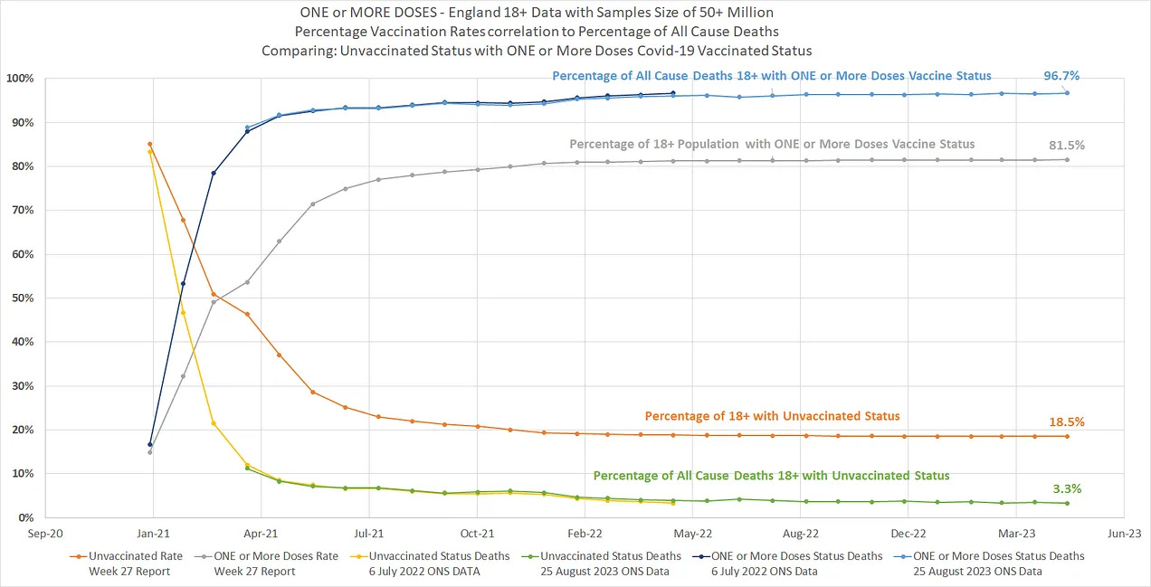
Look at the data sources and you will see that the percentage of vaccine uptake is displayed on the same graph as the percentage of that vaccine groups representation of all cause mortality.
Had the vaccinated been given pure water the vaccine uptake percentage lines and the proportion of the population represented by the vaccine uptake range would have indeed been the same.
That's the whole point; they are not the same and they are consistently not the same for one dose , two dose and three dose charts and data. In the related Substack for the tiny 0.5% of the all cause deaths that the 18-39 cohort population represent while the same cohort represents 40% of the total 18+ cohort population (Over 19 million people) you see the SAME disproportionate all-cause death charts and Data; AND AGAIN INCEASING WITH DOSE
There is no way for this 18-39 Cohort that one can claim their 0.5% of all cause deaths affected the other 99.5% of all cause deaths in a significant way.
On top of that, even if one DID try to apply the "disproportionate uptake of vaccine" line to say "we are not seeing what we are seeing" you are then faced with everybody seeing what they are seeing even in the young 18-39 year cohort in the subsequent Substack See:
https://open.substack.com/pub/thenobodywhoknowseverybody/p/further-proof-the-age-adjusted-argument
Its not about feelings or bad experiences with some other partial data set from Germany, or from wherever, and its not about applying labels that simply don't hold like "Simpson's paradox"
"Simpson's paradox is a phenomenon in probability and statistics in which a trend appears in several groups of data but disappears or reverses when the groups are combined"
Because the "trend" remained in the 18-39 group as with the"18+ (Combined group).
AND IT MATCHED THE COMMON SENSE HYPOTHESIS
The Substacks are completely transparent and the data sources and working files are there for ALL to review , download and obtain still further charts. There are NO assumptions of vaccine uptake there is just charting of the ACTUAL vaccine uptakes and charting of the ACTUAL corresponding representation of the UPTAKE group's percentage representation of all cause mortality.
The wonderful part of the "England" data is there is no more hiding the Vaccine Uptake figures that were "buried" in the "public domain" in a most obscure inclusion into an ONS data file of a UKHSA Forthnightly National Influenza and COVID-19 Report.
The ONS data file was supposed to represent the data of "Figure 19".
From that figure; one would NEVER have been able to guess that tab of Data in the ONS file for this figure contained the entire England Vaccine Uptake by age groups from the beginning Jan 2021 up until 2nd of July 2023 which more than handsomely covered the period of the ONS All cause mortality Data. It was a cat out of the bag data set!!
I dare say if you could find the same two matching data sources for your Germany data ,which you clearly do not have; hence the wild paradox that you can produce , we could apply the plausible Hypothesis to the properly understood and graphed German data.
See if you can find the data sets and hence eliminate your need for so many assumption and give up on the idea that a Paradox can be allowed to exist when you have the two necessary data sets to hand.