Excess Mortality in Germany
Traces in the Heat Map
They say a picture is worth a thousand words. This article illustrates the German mortality situation in the period 2021 - 2022 by a heat map and discusses general rules and numerous anomalies.
First, we will highlight some basic relationships. The heat maps shown are arranged vertically by 14 age cohorts and horizontally by calendar weeks (CW).
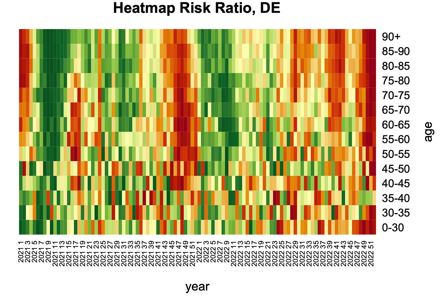
Fig. 1: Heatmap of the risk ratio (mortality events 2021-2022), DE
The colors represent the risk ratios spezific for each age cohort and the given weeks and highlight the deviation of the actual from the expected mortality risk. The rule of thump is: The redder the more die and the greener the less. Single fields say nothing, but clusters of certain shades do.
Methodology
Mortality risks were calculated from death rates and population figures, drawn from Destastis, the German statistics authority. From a reference period, for the main analysis the years 2016 - 2020, trends and seasonality were determined and predicted for the future with the use of Time Series Linear Model (TSLM), computed in R. The validity of the reference period was checked by test runs over varying reference periods back to 2011. The actual mortality risks of the years 2021 and 2022 were divided by the predicted yielding the risk ratios. A risk ratio >1 represents excess mortality, ≤1 represents normal and under-mortality. Such risk ratios were calculated separately for the 14 given age cohorts and each of the 104 weeks, yielding a total of 1456 fields. Finally, the RRs thus obtained are assigned to a color palette. Each color represents the same magnitude of excess across 2021 - 2022.
Normal Patterns
In the lower part, i. e. in the younger cohorts, numerous jagged contrast edges are present. This is noise. With low numbers of cases, random scattering accounts more and has stronger effect on the colors. With increasing age, the color gradients become more uniform, and seasonality increases. After strong death waves, a phase of under-mortality normally occurs. Below the age of 40, no seasonal signal component can be detected anymore.
Fig. 2: Death waves with typical subsequent sub-mortal phases form broad clusters with red-green color change in older cohorts.
During the summer months, heat signals occur occacionally and then appear as sharp, vertically continuous lines, such as in 2021 in CW24 and in 2022 in CW29 and CW36. (Fig. 3)
Fig. 3: Heat waves form stripe patterns in older cohorts.
Abnormalities
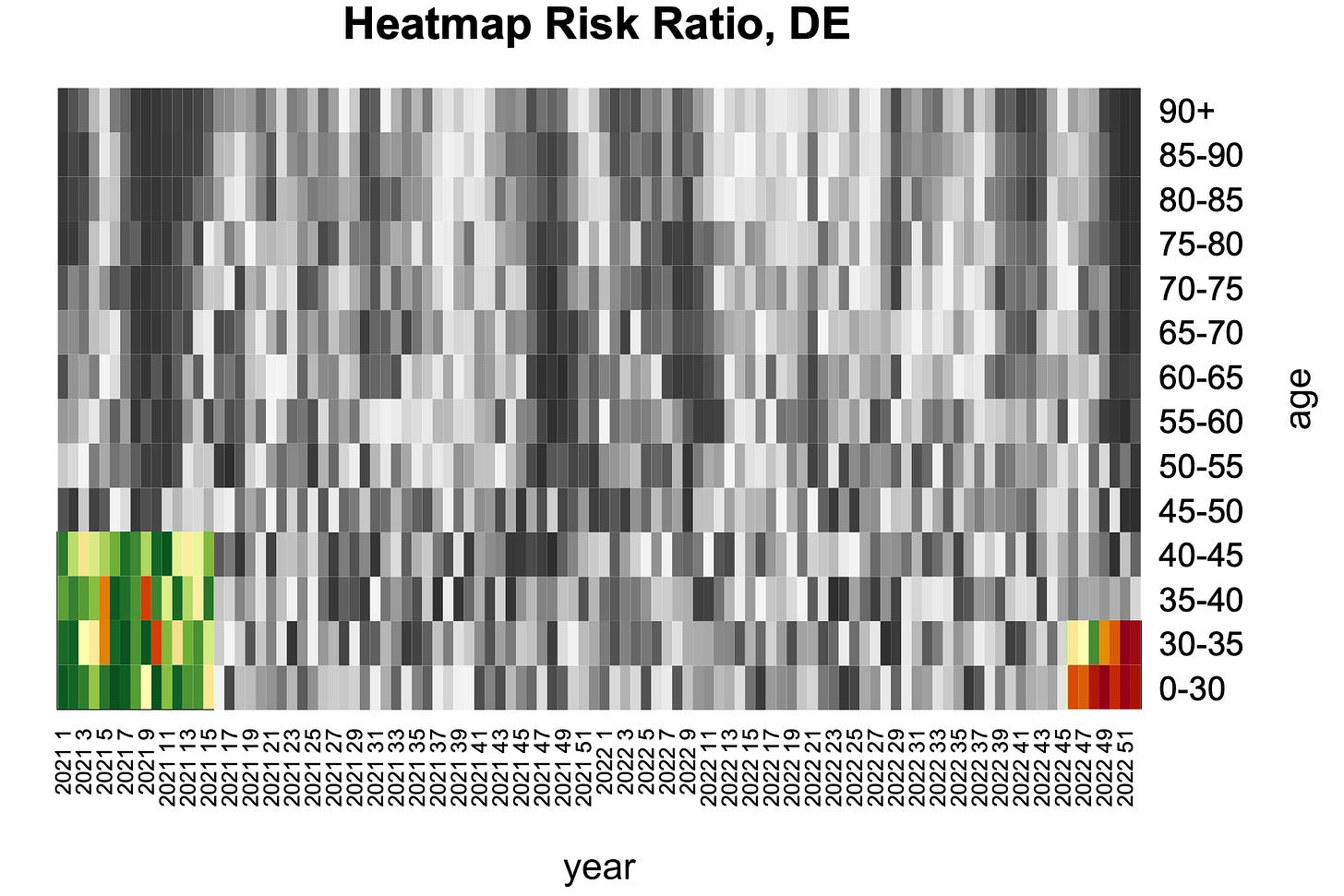
Due to effects of non-pharmacological-interventions, two conspicuous clusters are found among young people. (Fig. 4) Early 2021, private and public life were at rest. This was associated with a reduction in accident risks, which account for a high proportion of deaths among younger persons. This cluster appears green. In contrast, a deep red cluster is seen in people younger than 35 toward the end of 2022. May infectious diseases have met immune systems with training lag?
Fig. 4: Abnormalities in young people.
In the overview (Fig. 1), a left-right gradient in the color shades is noticeable, with a focus on the 2nd half of 2022. This fits with calculations of life expectancy, which remained significantly below expected values in both years, with the worse level in 2022. The red shading is particularly pronounced in a large corner in the upper right, but also in the lower right among the very young.
In 2021, possible links with the COVID-19 vaccination campaign must of course be investigated.
Fig. 5: Vaccination histories by dose. Source: Immunization monitoring of the Robert-Koch-Institure (RKI).
The vaccinations started in Germany on 27 December 2020 in the oldest people and speeded up at the beginning of 2021 in decreasing age panels. Early 2021, a strong mortality wave had also just passed its peak that occurred in the CW53 2020. If the vaccinations caused additional fatalities in January 2021, it had to show up in a prolongation of the excess mortality phase - and that for the old and not for the young. And indeed, it shimmers in red at the top left!
Fig. 6: Prolongation of the mortality wave among the elderly at the beginning of 2021.
As of April 2021, vaccines could also been administered to doctor's offices, beside the mobile vaccination teams (for nursing homes) and later specialized vaccination centers. Vaccination prioritization (mainly by age) was officially dropped in June. More and more younger people were included in the vaccination program. An initial peak in vaccination coverage was reached at this time. If there were any timely deaths from these vaccinations, it would now be evident in the middle-aged cohorts (Fig 7). Take a look on this remarkable pattern.
Fig. 7: Mortality focus in middle-aged cohorts, spring 2021.
Such an accumulation in spring weeks and in these cohorts is unprecedentend and lacks any explanation - apart from the vaccinations. These deaths were not reflected in the overall mortality figures, but in a significant drop in the mean age at death in those weeks.
In Autumn 2021, booster vaccinations began, again first among the elderly. They now had the longest history of basic immunization. In addition, another strong winter mortality wave was just around the corner. In this scenario, what would be expected from additional fatalities from vaccination? An advance of the wave in the elderly. (Fig. 8)
Fig. 8: Mortal shaft with inclined axis in the upper part.
This wave is not straight, as is usually the case. It tends to start and end somewhat earlier among the older age groups. There is also a noticeable cluster in the 40-45 age group. One could think of the increasing reprisals against the unvaccinated during this time, which drove many to the first injection. At the same time as the boosters, doses 1 and 2 also rose again (Fig. 5), and the median age at death dropped conspicuously, as it had in early summer.
The year 2022
In terms of excess mortality, the year 2022 clearly surpassed 2021, which is reflected in the heat map as an overrepresentation of red and orange shades. The year had started quite normal. After week 6, the "second boosters" came into play. Compared with the vaccination frequencies in 2021, the number of doses was much lower this time, but again mainly the elderly took the jab. The dose-4 rates reached a first maximum in CW14. Does the heat map show any discoloration in this regard? I guess: yes.
Fig. 9: Cluster of second boosters.
This color signal does not look spectacular. However, after the previous mortality wave, the green shades should predominate, but they do not. Last but not least, it should be taken into account that the assessment period 2021 - 2022 was overall over-mortalized, so the middle of the color scale represents a slight over-mortality.
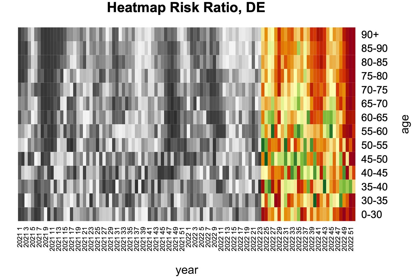
In the 2nd half of 2022, the situation seems to really tip over. Green tones appear only sporadically, nowhere in clusters.
Fig. 10: Situation as of week 24 in 2022.
In the upper part, three red waves can be recognized. The first includes the heat wave in CW29 discussed above, but it trails an orange plume for several weeks. Note in this context dose 4 did not drop to zero at mid-year. A second wave, centered around CW41, hit people over 60, and here a connection with vaccinations is also likely. The vaccination curves in Fig. 5, namely regarding dose 4 to 6, show a temporal coincidence with the signals in the late summer and autumn weeks of 2022. Accordingly, these waves are outstanding: No other cause is able to explain this cluster, which is clearly delimited in terms of age and time.
The dark red stripes on the right margin represent the fatal end point of the year 2022. Although they can no longer be directly linked to signals of the vaccination curves, they fit into the overall picture insofar as health damages appear to persist over the longer term and can add up from dose to dose.
One important answer is left. The color shades illustrate variations in relative risks. However, the important question of effect size remains. Expressed in deaths over expected value, the years 2021 and 2022 accumulated 105,000 deaths, conservatively calculated. This means that the expected values were determined from a reference period that tends to generate positive apparent trends in cohort mortality risks, as present the 2016 - 2020 time window. Using 2015 - 2019 as reference period, far higher excess mortality of 155,000 deaths is obtained for the years 2021 to 2022. The most probable value is within these limits.
Discussion
Using all the demographic-statistical instruments discussed above, it is interesting to determine the point in time at which a threat to public health became apparent from purely demographic data. By inoculating into the death wave in winter 2020/21, excess deaths of any cause had been masked for a while. But this could no longer be true for the death cluster of middle-aged people in spring 2021 described above. Moreover, the problem could have been read off promptly from time courses of mean age at death and life expectancy, i.e., standard statistical variables. Until spring 2021, the cumulative excess mortality was still within computational limits. The more than 100,000 deaths described above are therefore mainly the result of the following period. This should have been noticed at an early stage by the authorities if one had looked in a competent place.
The denial of their ability and obligation to recognize, in short the deliberate looking away, corresponds to the "blasphemy against the Holy Spirit" from Christian moral theology. In the Gospel of Matthew it is said that every sin will be forgiven, but this one will not, neither in this age nor in the age to come. In the history of this pandemic, a great deal is connected with the deliberate, or rather organized, looking away.


Thank you. I have included this article in the Excess Mortality data point collection
https://totalityofevidence.com/excess-mortality/