

About mortality displacement
About mortality displacement
Harvesting and dry tinder effects are not what people think they are.

In the time series of deaths, mortality rates (MR), life expectancy (LE), etc., there are outliers, called “shocks”, in some years. In between, the years follow a regular, seasonal pattern. A plausible argument in this context is that if many sick or old people die in one go, this would cause a pull-forward effect (harvesting effect). On the other hand, the absence of shocks would lead to an accumulation, resulting in an increased vulnerability of the population (dry tinder effect). In the specialist literature, both are referred to as mortality displacement.
Since I’ve been dealing with figures of this kind, I wondered how strong these effects might be and how long they may last. Even when looking at the general trends, for example at Euromomo, you can see that mortality never falls below a certain basic level. A false impression can also arise if a seasonal wave occurs earlier than usual. For a while the comparison looks like excess mortality (EM), followed by a phase of sub-mortality. This is a misunderstanding. Mortality displacement is probably overestimated, or could even be a statistical illusion.
The specialist literature also seems to be very cautious.
Huynen et. al. (2001, Netherlands):
“We found no cold-induced forward displacement of deaths.”
Islam et. al. (2021):
“Little evidence was found of subsequent compensatory reductions following excess mortality.“
So what now? As a first oracle I consulted my own numbers. The weekly LE seems to be suitable for the purpose. Its course portrays a mirror image of ASMR (Age Standardized Mortality Rate) with minor deviations, but advantageously does not require an arbitrarily chosen standard population. (Fig. 1)
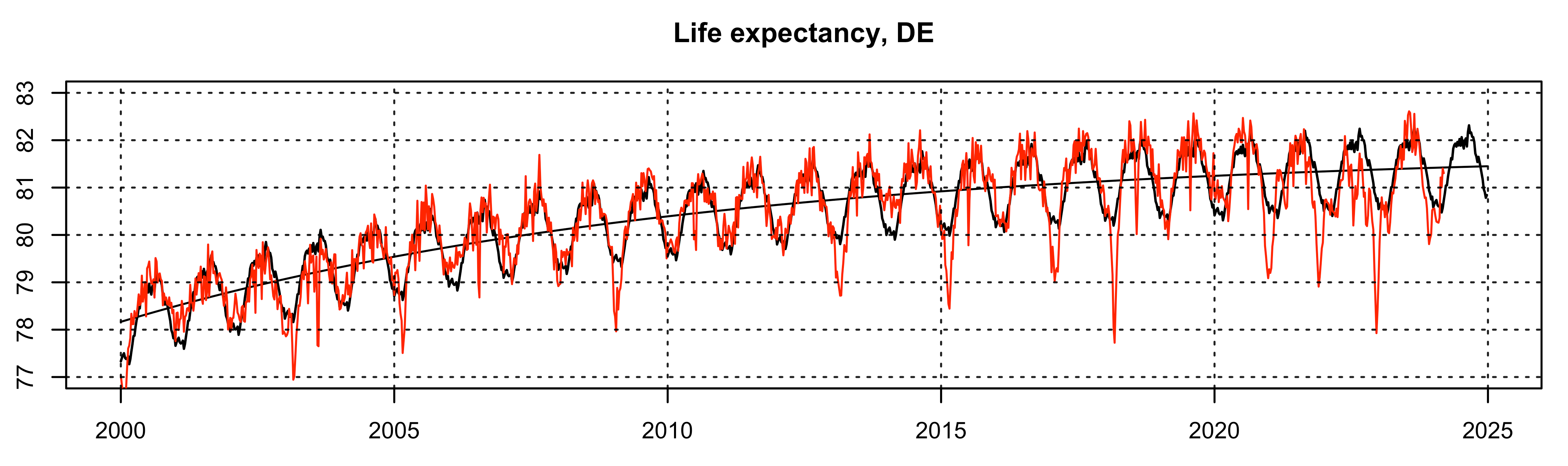
Fig. 1: German LE (red) with seasonal and trend component (black)
The shocks mentioned above appear as nadirs during the flu seasons and the summerly heat weeks. In order to compare the course of different years, the trend and seasonal components must be stripped off. This will be done by STL (Seasonal and Trend decomposition using Loess). What is left over is called remainder. (Fig. 2)
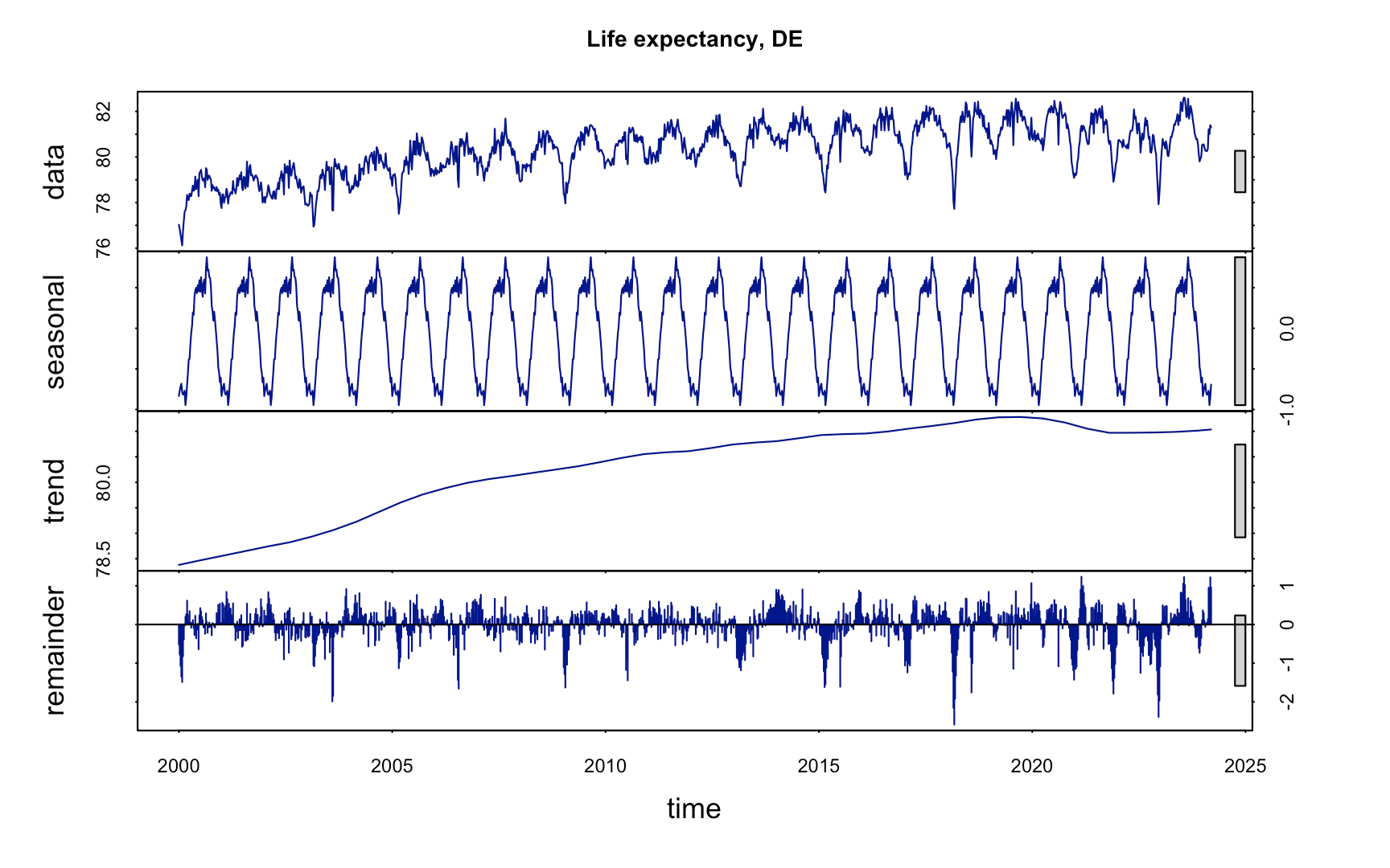
Fig. 2: STL-decomposition of LE
The remainder signal (∆ LE) depicts the weekly deviations of LE from the expected values. As the decomposition works correctly, ∆ LE has a zero mean over long periods of time and its integral crosses the zero line at every change between EM and sub-mortality. Due to these properties, periods with EM can be detected from the ∆ LE signal. The individual years are divided into two groups by a simple condition. If a year up to calendar week (cw) 35 has collected a negative ∆ LE sum, it is counted as an EM year, otherwise as normal. Both types of shocks, those caused by flu and heat, can be reliably detected this way. Finally, the average yearly course of both groups is calculated (Fig. 3).

Fig. 3. Yearly average course of years with EM (red) and normal years (green).
The flu season appears as negative area of ∆ LE with a minimum at cw 8 and a subsequent improvement towards the zero level. Slightly negative values remain during the spring and summer weeks. In the last quarter of the years a significant amount of weeks is ranking above zero. Thus, a mortality displacement cannot be claimed as an immediate consequence. It may come into effect in the following cold season.
Meanwhile the green line, which indicates years of normal oder subnormal mortality, shows a slight sinking in total. During the early weeks, positive deviations are detected. This must not be judged as a remarkable plunge of mortality, but simply the absence of shocks during the flu season. They then appear to be positive compared to the average.
What both signals have in common is an approach to the zero line before the 20th week, but without any compensation occurring.
In addition, EM until cw 20 is chosen as a selector. Therefore, only shocks during the flu season are taken to the decision, wether or not a year is rated as EM-year (Fig. 4).
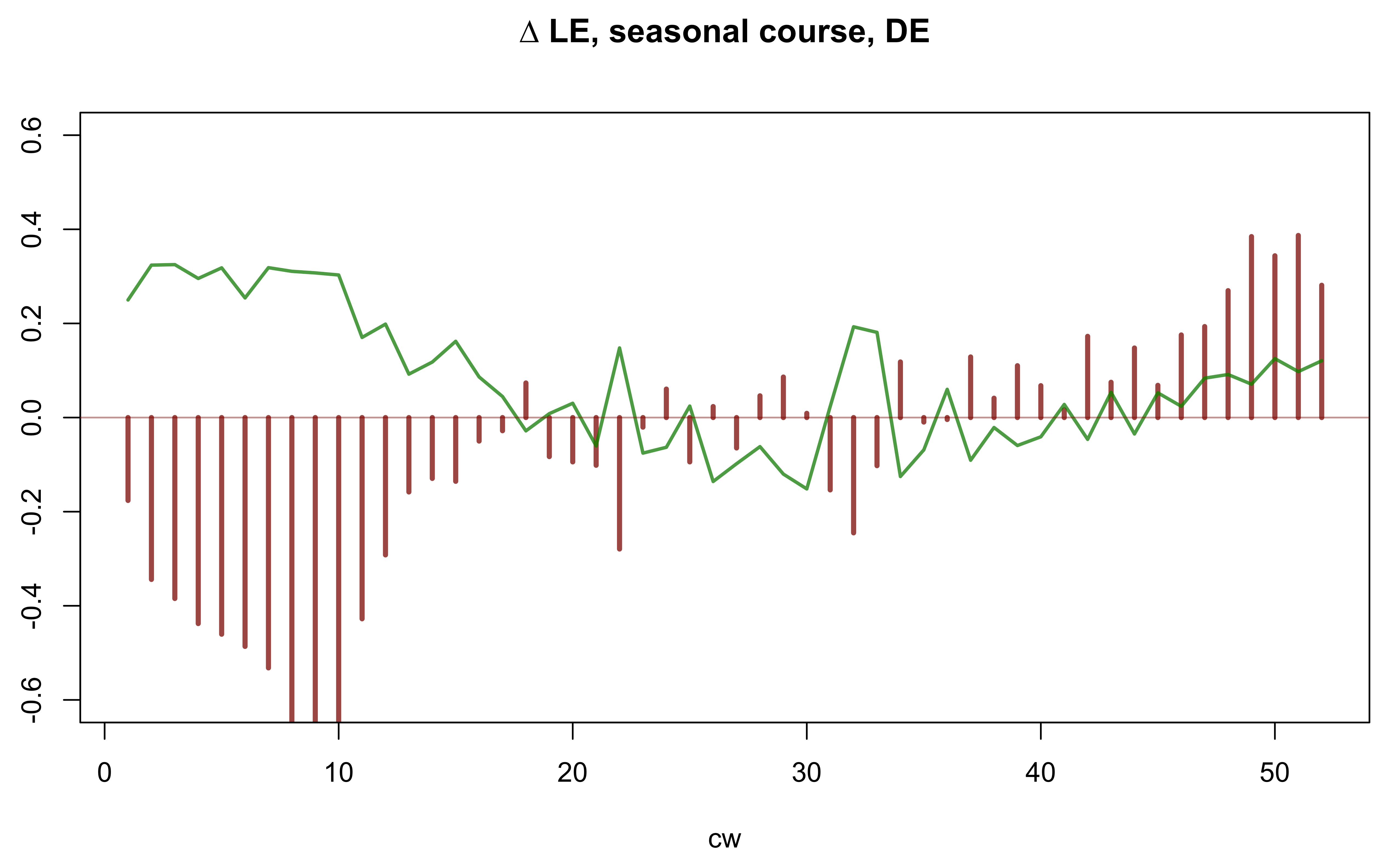
Fig. 4: Description same as Fig. 3.
On this condition the picture looks similar, but during the spring and summer weeks the values fluctuate around the zero line. Again, a mortality displacement ist not detectable for a time span of about 20 weeks.
To round off the impression, one can plot the autocorrelation function (ACF) of the entire ∆ LE signal (Fig. 5).
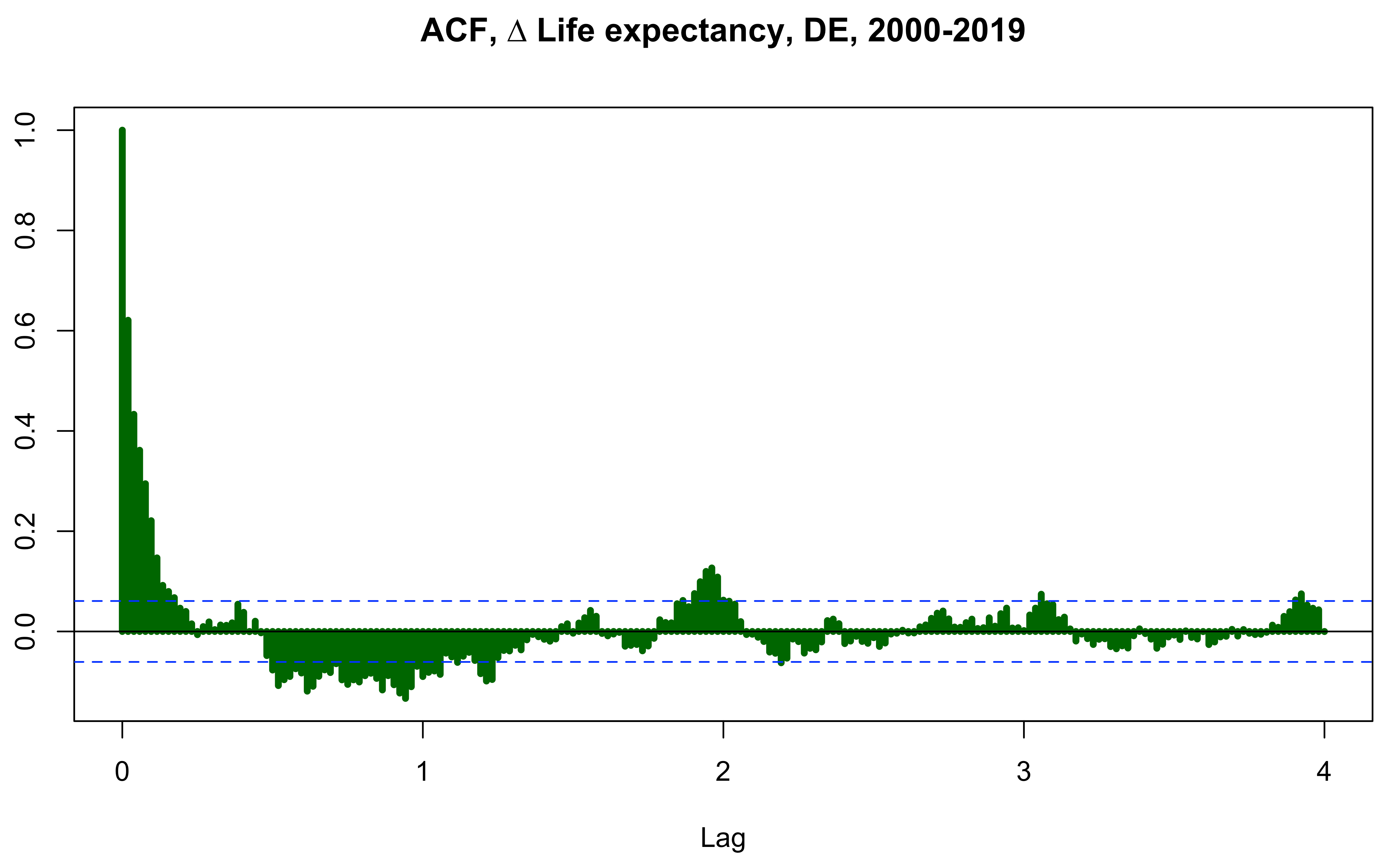
Fig. 5: Autocorrelation function of ∆ LE. Lags up to 4 years. Blue lines indicate the boundaries of significance.
Each bar of this signal indicates the correlation that the signal creates with itself if shifted by the associated lag. So at lag 0 the correlation must be 1 by definition. As the lags increase, the lines approach zero, but increase slightly at around 0.3. The latter is an impact of years in which both flu and heat occurred. This actually was observed in 2003, 2015 and 2018. In a broad range of lags from ca. 0.5-1.3 negative correlations become dominant, but this only describes the normal interdependence of normal phases and EM phases, which frequently have a time distance of this magnitude. A remarkable, narrow peak is detected at a lag of about 2 years. This can be interpreted as a certain probability of flu shocks every two years. (The same applies to further occurrences near lag 3 and 4.)
It’s time now to widen the oracle beyond national borders. Unfortunately, there is hardly any weekly LE data available. So MR have to be consulted alternatively. These are closely related to the LE. Human Mortality Database HMD provides such stuff for many countries, from which I chose a subset of 20 countries concerning the northern hemisphere, covering different climate and cultural regions, namely Italy, Spain, Greece, France, England-Wales, Switzerland, Germany, Netherlands, Belgium, Denmark, Sweden, Norway, Finland, Poland, Russia, USA, Canada, Korea, Taiwan and Israel.
EM is given in rough grained age groups. The cohorts 75-84 and 85+, which contain around 2/3 of all deaths, are examined here. The method is the same as described above, but now the remainders of MR (∆ MR) come on the scales (Fig. 6).
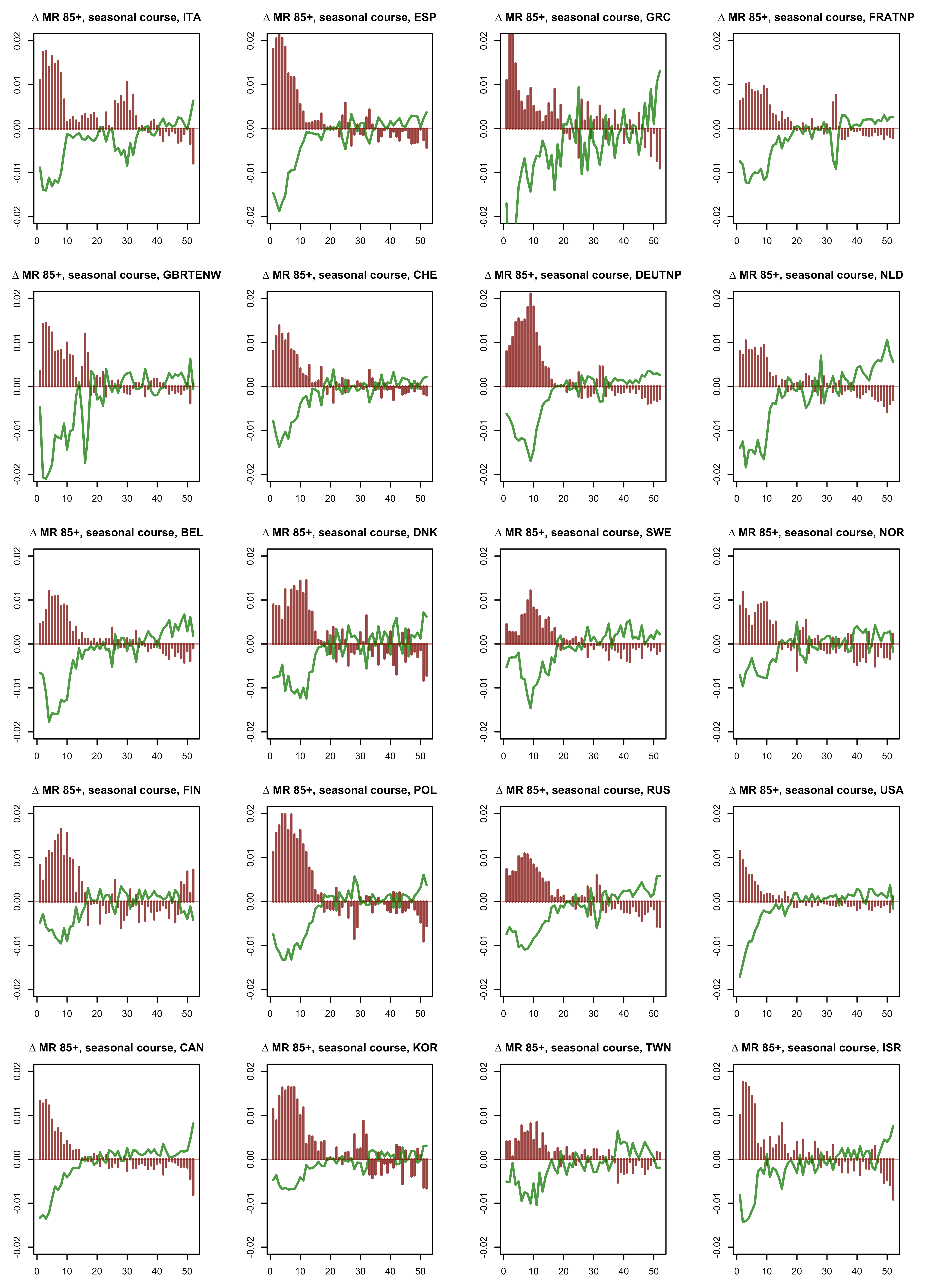
Fig. 6: Seasonal course of 20 countries, normal years (green), EM years (red). (Open in new tab to enlarge.)
Although the countries reveal considerable differences in detail, on average a clear pattern crystallizes and it corresponds to the already known for ∆ LE. Note that the courses of ∆ LE and ∆ MR appear mirrored (Fig. 7,8).

Fig. 7: Average seasonal courses from 20 countries, age 85+.
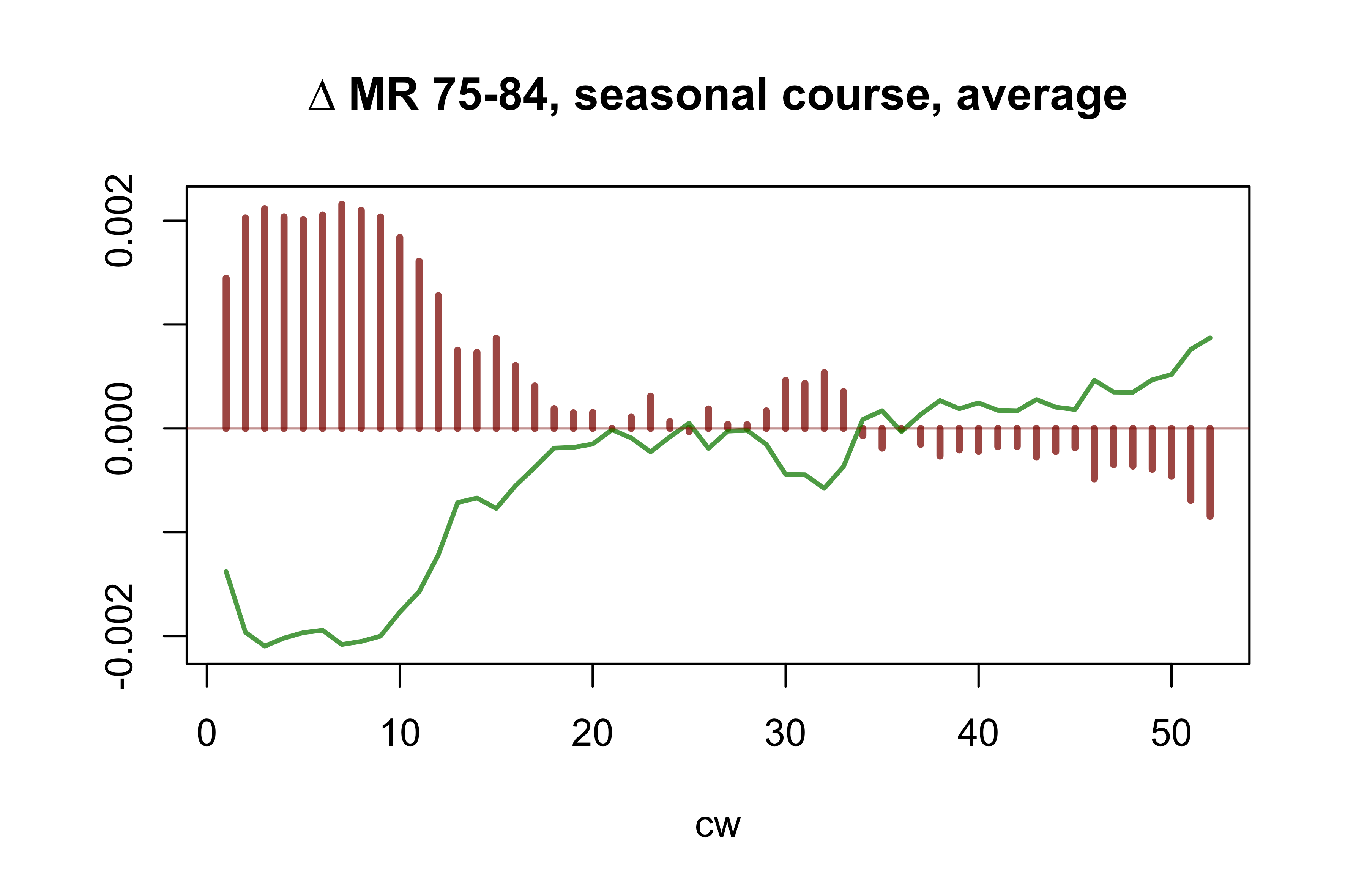
Fig. 8: Average seasonal course from 20 countries, age 75-84.
We can now summarize the observations into a few rules that, given the diversity of the data, can be viewed as quite well established.
Years starting without flu shocks show an increasing course of mortality. The idea of the dry tinder effect seems to be displayable.
Short-term mortality displacement does not occur. Years starting with flu shocks run along the zero line for the duration of the summer with occasional perturbations caused by heat shocks. A harvesting effect seems to occur in the following cold season. While flu shocks generate a very high amount of excess mortality for a short period of time, the subsequent compensation happens over a longer period of time and to a lesser extent.
Heat generally seems to have a weaker influence. Although individual summer weeks can reach extreme EM values, heat waves end after approximately 3-4 weeks, even if hot weather lasts much longer. Flu waves last more than twice as long. After a heat wave the mortality figures return to normal levels and remain there without any tendency of compensation.
After all, we should remind of some basics. The model we have used for LE (and MR) identifies trend plus seasonal course, and what remains (∆ LE) can mainly be explained via occasional shocks centered around cw 9 and cw 30. The statistical distribution of ∆ LE (Fig. 9) is skewed to the left, i.e., while there are weeks with rather negative ∆ LE, no positive counterparts are observed.
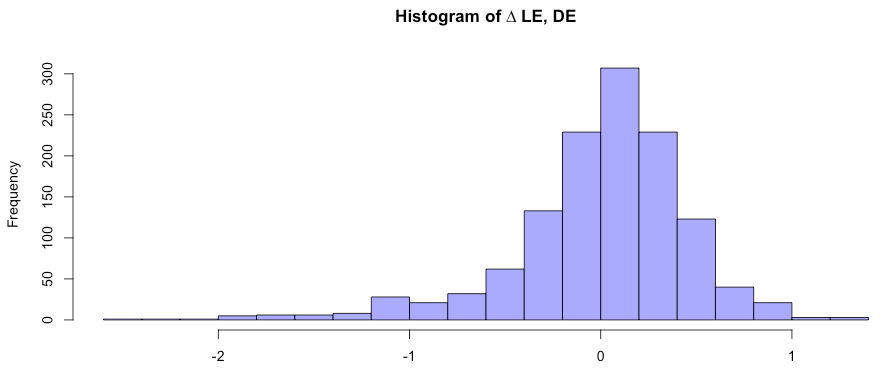
Fig. 9: Statistical distribution of ∆ LE.
If we claim a mortality displacement based on the arguments presented at the beginning, a compensation must instantaneously occur. But it does not. What we determine, is a tardy compensation. This is consistent with the statistical distribution, but contradicts the argument for the existence of immediate, voluminous compensation effects.
Doubts remain.
I didn't write an article about it.
I just compare the mortality from especially 80+ which are most influenced by virusses and seasonal mortality.
Week 40-52-19 compare by week 20-39.
And i couldn't find a relation during high mortality in winter, and low in summer, and vice versa.
Some think, you can add and substract deaths from one year, directly to another year.
I expect next thing happen:
Population of 1000k 80+, and deathrate of 10%.
At the end of the year, 100k died, and in the same time, 100k 79'ers get 80, and again you have a population of 1000k. And this happen year after year.
If in one year, an extra 8k wil die due New virus, so 10.8% deathrate. At the end of the year, you have an population of 892k. You add again 100k 79'ers and your Total population is 992k. So next year, the expectation by 10% deathrate is in this case 99k2 so 800 less as normal.
This is only 0.1% and not remarkable.
Best Regards. Bonne.
Have you looked at the timing of mass Flu Jabbing in relation to subsequent Deaths in over 60s or other age groups?